
Image by tonystl
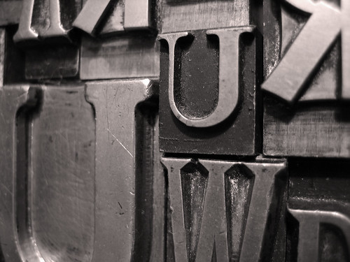
Typography. Typefaces. Fonts. Type styles. These days, we practically take our countless choices for granted. It wasn’t long ago when creating a typeface (especially one completely original) involved thousands of hours of pencil to paper research and conceptualizing, followed by more time spent creating the actual letterforms in metal.
As a traditional type designer, it seems to me you had to be part artist, part blacksmith, and part mad for wanting to even set out on such a grueling & creative journey. It’s hard to imagine the work that went into making a font that was unique, unlike any others at the time. But the payoff for such an achievement can be huge. There are several great fonts that have been around for a long time and that has to be a truly satisfying feeling for a typographer.
For a non-designer, it’s probably easy to write off the importance of a typographer’s work, but when you think about how many fonts you have at your disposal in a mouse click, it’s hard to deny. Sure, many of them are merely subtle makeovers of existing typefaces, but everything needs an update eventually. Perhaps one of the signs of absolute greatness in a font is its lack of mutations. It’s hard to improve on perfection, as the saying goes. Of course it’s easier to find fast, cheap makeovers which do little to improve the core design of the typeface and its appeal.
One of the more recent examples of this (50ish years ago) is Helvetica. Its simple, almost generic personality is brilliant. It’s everywhere and yet goes nearly unnoticed, even to some of us designers. It’s even the subject of an eponymous feature-length documentary. Many would argue Helvetica is the end of the line in typographic evolution.
I’m not sure I’m buying it, however. As long as there are creative minds out there, always thinking, always wondering, always experimenting with type, it will always evolve. We wouldn’t be so fortunate to have as many typefaces as we do now if everyone believed in a perfect font. And we’d probably still be molding our letters & words from lead.
Be sure to read: Font for Thought, Part 2