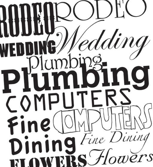
 Fonts. There are thousands. And thousands. So as a designer it makes it that much more important to select a font that best represents and differentiates each client. Whether it is an advertising campaign or a typeface for an identity, its important to choose a font that relates to the company, is consistent with the overall marketing efforts of the company, and appeals to the audience.
A font has the ability to instantly evoke an emotion or idea in a reader. This is what makes certain fonts easy to dismiss when faced with a theme. For example, when you hear or see the words bridal or wedding, a script font with lavish flourishes probably comes to mind. On the other side of the spectrum, the words bulldozer and construction bring bold, squared typestyles to the forefront. Using the right font can do a lot to legitimize a brand in the eyes of a potential customer. If it doesn’t seem to match what that person feels a product should be, then chances are it won’t sell to them.
Granted, no two people think exactly alike, but you can at least level the field by using a font that works on several levels and encompasses a range of ideas or thoughts that you are intending to achieve. The process of font selection can become an intensive one and it’s often a process that is overlooked or taken for granted. And there are many font uses that do not make sense. Typically this is because the person who chose the font thought it was cool. They probably didn’t think about the recipient and/or how the font would be interpreted.
So, that’s a little food for thought the next time you’re reading a billboard or browsing over a menu. How does that typeface make you feel?

