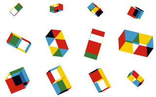
 I first came across Cooper Union’s new identity about a year ago, and I’m still very taken by it. The mark itself is clean, modern, and eye-catching, a great update of the school’s look. What struck me the most, though, is the animated version that appears on their website. With a mouse-over, the geometric design flies apart, momentarily reconfiguring itself into one of several variations, then sliding back into the original form. This playful interaction is more than just a gimmick – it actually adds meaning to the identity, making a statement about the school’s interdisciplinary approach to art, engineering and architecture, interrelated fields which flow together and build upon each other, just like the mark’s different-colored shapes.
 This is a great example of a growing trend: brand identities which are conceptualized, from the very start, to appear in motion. Though animated logos have existed for years, in most early cases these marks were originally designed as a static image, and animated at a later point. This has changed with the growing dominance of web and mobile media, which for many companies are now the primary touchpoint with their audience. With the understanding that a logo will appear mainly in a digital context, where it can be easily shown in motion, designers are now giving the animated version of a brand identity greater consideration during the design process, even letting it drive the concept in some cases. We see an extreme example of this new approach in the Sagmeister & Walsh-designed mark for the Portuguese concert hall Casa da Musica, which derives its variations from different views of a rotating 3D form.
 Identities like these are part of a larger trend in design: the dynamic, or modular logo. Rather than acting as a static stamp, these identities change form depending on their context, whether by sampling colors from a photo, like the Casa da Musica mark, incorporating new imagery, like the identity of the Ontario College of Art and Design, or even being redrawn by the audience, as in the case of AirBnb’s much-discussed “Belo” icon. A logo which actually moves in order to adapt is, in a way, the most literal application of the concept.
For now, this dynamic approach to identity and branding is mainly limited to organizations seeking to showcase their experimental, innovative nature. However, to a young motion graphics designer, the implications for the future of the brand identity are quite intriguing, and I hope to see more motion-based logos in the coming years.
See some of BrandQuery’s brand identities in motion below.

